I was at lunch with a friend this week, and he suggested the idea that home prices in his neighborhood (near Diamond Head) may have escaped the Great Recession altogether and, in fact, appreciated a bit along the way.
While it is common knowledge that the worldwide financial crisis did great damage to real estate prices in much of the United States, Hawaii was impacted less, and it is certainly possible that a desirable sub-market (like the Diamond Head area) could have emerged unscathed.
I decided to check it out.
MLS Local Market Statistics – Kapahulu – Diamond Head
The graph and data table below shows MLS sales statistics for the Kapahulu – Diamond Head area from 2002 through June 2013:
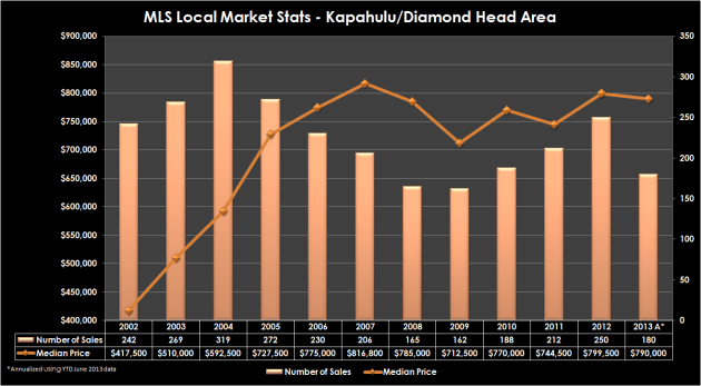
Source: Honolulu Board of REALTORS® and Chris Ponsar, MAI
The graph clearly shows the amazing run up in prices experienced in the subprime era (pre-2008), with median price peaking at over $800,000 in 2007 (number of sales topped out at 319 in 2004).
A closer look reveals the supply/demand relationship: As the median price continued to climb after 2004, fewer and fewer buyers were pulling the trigger. Conversely, when median prices bottomed out in 2009, demand began to increase.
The following table analyzes the data a little differently:
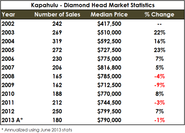
From the peak of the market in 2007, the Kapahulu – Diamond Head submarket declined four and nine percent in 2008 and 2009, respectively, and about 13 percent overall, before recovering a bit in 2010.
Considering these figures, it looks like my friend’s neighborhood took a moderate price hit after the collapse of Lehman Brothers….but our work isn’t done.
Wait a minute. Kapahulu – Diamond Head, that’s kind of a mixed bag, isn’t it?
It is. And as it turns out, much more mixed than I originally thought.
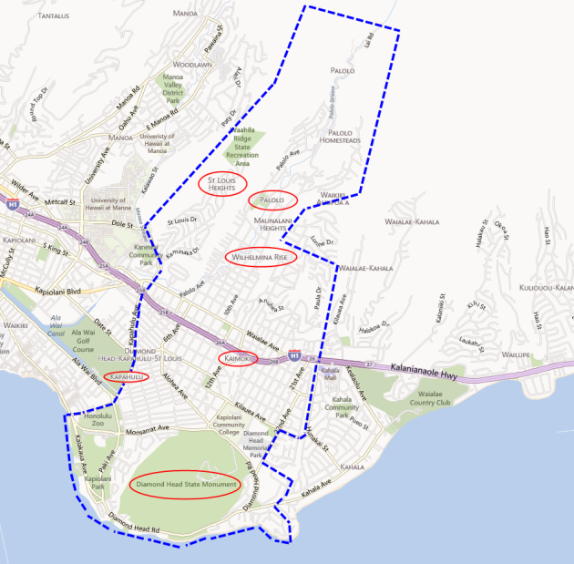
The Honolulu Board of REALTORS® defines the Kapahulu – Diamond Head Local Market Area as including sections (1) 3-1 through (1) 3-4. The map below approximates the boundaries of this area.
Sources: Bing Maps, City and County of Honolulu DPP, and Chris Ponsar, MAI
As you can see, the following neighborhoods are included in this statistical area:
- Kapahulu
- Diamond Head
- Kaimuki
- Wilhelmina Rise
- St. Louis Heights
- Palolo
If you’re familiar with Honolulu, you’ll quickly realize that is quite a diverse spread of neighborhoods! Great aloha to be had everywhere, but buyers looking to purchase around Diamond Head might not consider the other areas to be substitutable options.
Could my friend be right? Is it possible that his neighborhood (Diamond Head) is a micro-market that survived the Great Recession better than the other areas in his MLS Local Market? It makes logical sense that a desireable location like Diamond Head could have bucked the trend–let’s dig deeper.
Time to bring out the big guns – Paired Sales Analysis
My friend lives in Section (1) 3-1, which is shown on the maps below:
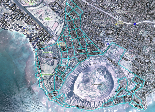
City and County of Honolulu, Department of Planning & Permitting
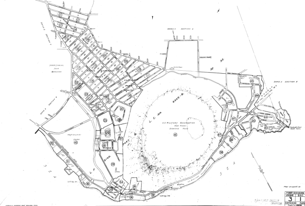
City and County of Honolulu Tax Map – First Division, Zone 3, Section 1
Commonly referred to as “Paired Sales” in Hawaii appraisal circles, “Paired Data Analysis” is defined as:
paired data analysis
A quantitative technique used to identify and measure adjustments to the sale prices or rents of comparable properties; to apply this technique, sales or rental data on nearly identical properties is analyzed to isolate and estimate a single characteristic’s effect on value or rent. Often referred to as paired sales analysis.
Source: Appraisal Institute, The Dictionary of Real Estate Appraisal, 5th ed. (Chicago: Appraisal Institute, 2010).
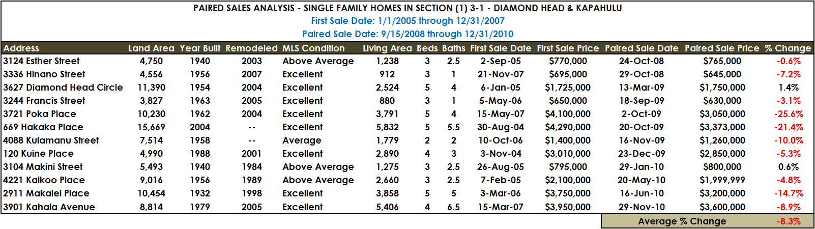
In order to accomplish this, I researched sales activity in Section (1) 3-1 (my friend’s general neighborhood) from 2004 through 2010, focusing on sales of single family homes that were listed by the selling agent as being in “average” or better condition.
My research found 22 “pairings”, single family homes in (1) 3-1 that sold in late 2004, 2005, 2006, or 2007 (the peak of the market), and later resold from September 15, 2008 (Lehman Brothers) through the end of 2010. Of these 22 pairings, 10 were substantially remodeled in the interim, and thus not considered.
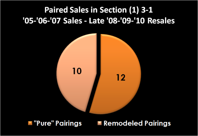
After the 10 remodeled pairings were removed, 12 “pure” pairings remained–resales of homes that were substantially similar in the time frame being studied. These 12 sales are analyzed in the chart below:

Click To Enlarge
As you can see, 10 of the 12 paired sales show price declines in the study period, ranging from negative 0.6 percent to negative 25.6 percent. The two positive indicators showed upward figures of 1.4 and 0.6 percent. The overall average price change for the 12 “pure” pairings (not remodeled) in Section (1) 3-1 was negative 8.3 percent.
Conclusion: Still looks like a price drop after Lehman Brothers, but not a huge one.
In the end, even though the Kapahulu-Diamond Head MLS statistical zone includes a diverse range of neighborhoods, it appears that the immediate Diamond Head area, like much of the United States, did indeed suffer a setback (negative 8.3 percent according to this analysis) in the early portion of the worldwide financial crisis.


Recent Comments